Why an old NASA logo is making a strong comeback
The Worm logo that NASA used in the 70's and 80's has now developed a cult-like following.

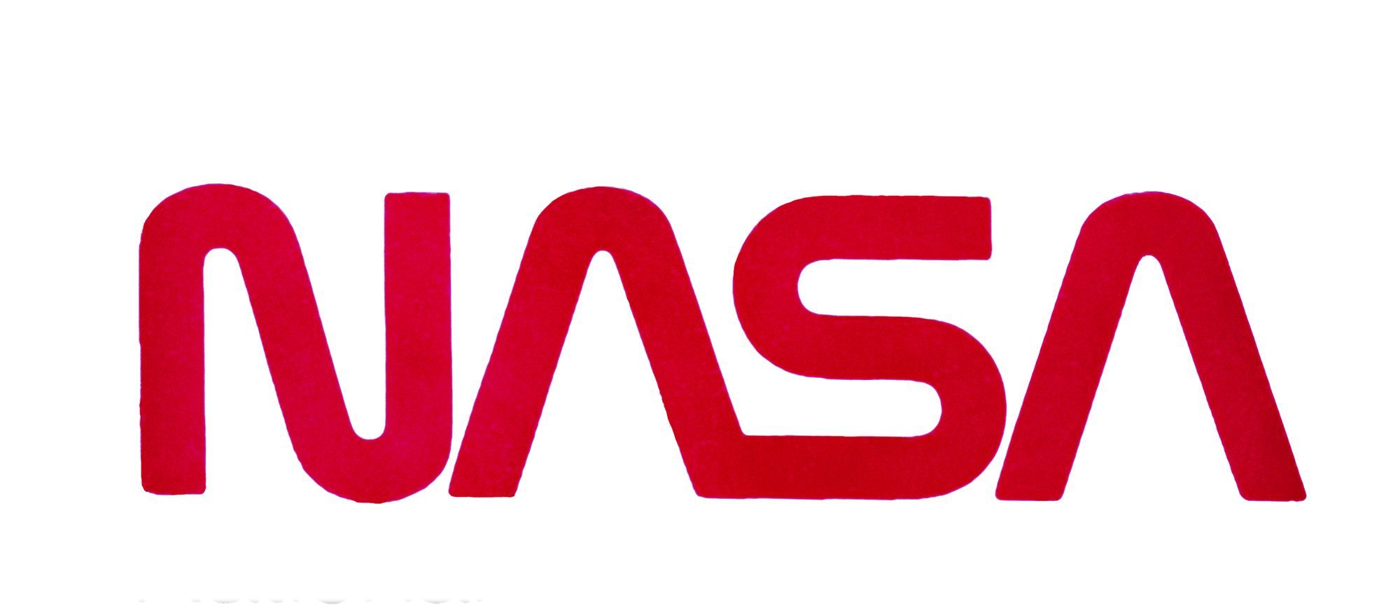
Nicknamed 'The Worm' - this old NASA logo, which was designed and adopted in the mid-1970's, is making a surprising comeback.
Not too many industries hold as much romanticism as space travel.
Gen X's grew up glued to the television watching shows like Star Trek, Battlestar Galactica, Buck Rogers and Rescue International.
Most people in the 40's can still distinctly remember the day in 1981 we all watched the NASA Space Shuttle launch into space - on live TV - for the very first time.
It was a time of hope, huge excitement and proof that we were living through the greatest time in human history.
Not much else really comes close to it - and in many ways, while sitting now in the stark reality of a global pandemic and watching the childish and idiotic behaviour of our so-called leaders; we
The Worm logo that NASA used in those days - is the one that has now developed a cult-like following.
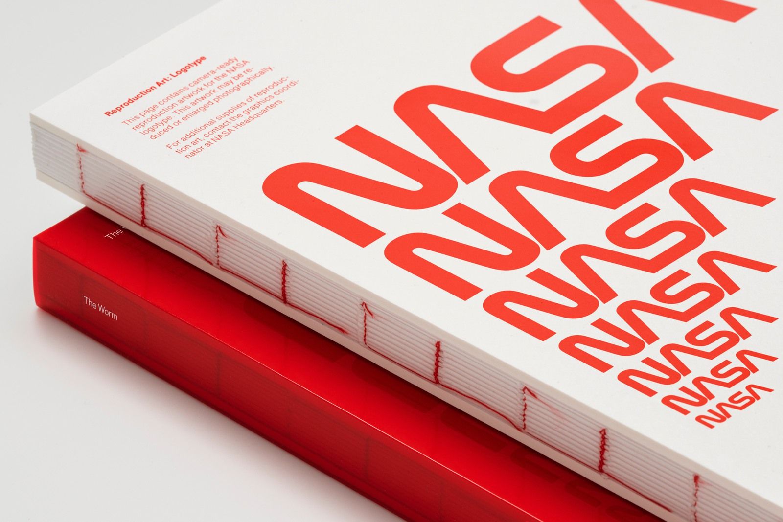
'There’s another reason why the worm has saturated popular culture: It’s damn good design. In fact, Reed says the fundamental architecture of the wordmark, which is anchored by two major visual elements—the As and the very similar N and S—”is so harmonious, it’s like perfect graphic design.” The shape of the As also mimics the nosecones of a rocket or shuttle, and suggests vertical thrust, with curves borrowed from aerospace itself. And the monoweight of the line gives the wordmark a machine-like feel, almost like it’s bent out of metal, according to Order co-founder Hamish Smyth.
The visual details might be more than the average person would notice, but it’s worth recognizing because it also gives the logo profound versatility. “The designer population probably understands how it needed to work on the piece of paper, on a letterhead or an invoice, and also on the side of a satellite, and how it needed to withstand those different applications,” says Reed. “The meatball isn’t designed to withstand the types of design considerations that graphic designers think about.” - via
For typeface geeks and those who really love The Worm - a new publication scheduled to come out in October will most certainly be on your shopping list.