Welcome back Pepsi
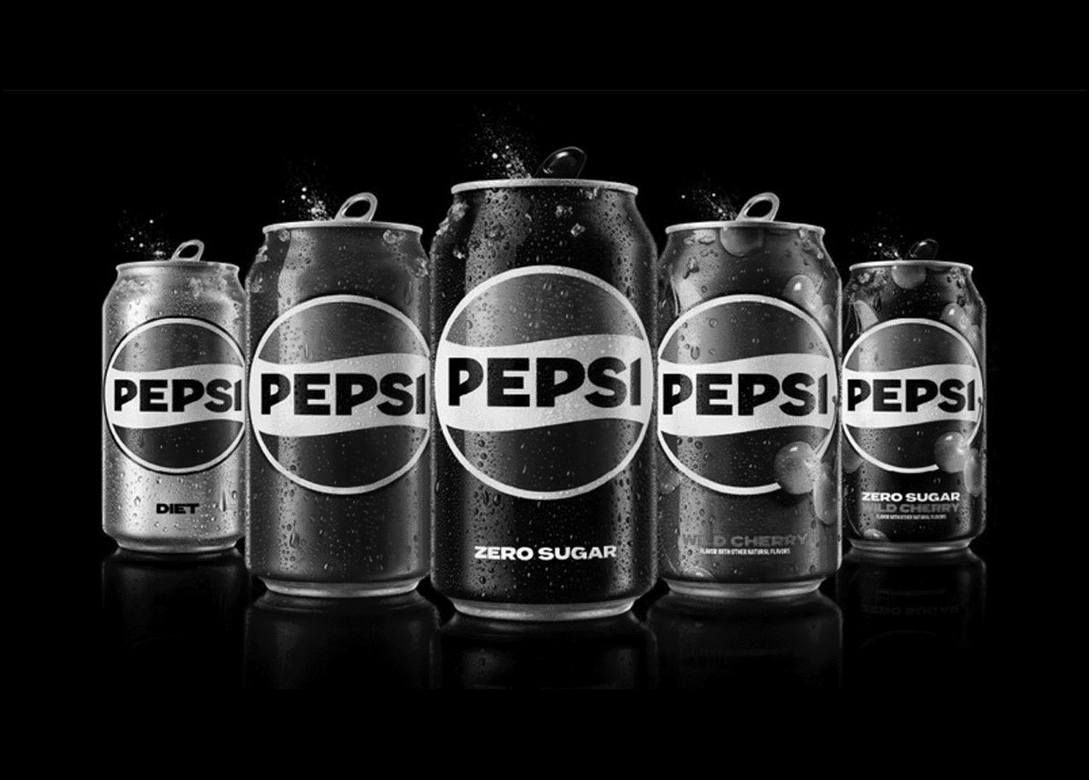
Pepsi have a brand new identity - and it's good.

Pepsi is one of those brands that historically comes across as if it is managed by a very large committee of accountants.
Strategically it has been all over the place. Never really settling on a defined path which has set it apart from its big rival.

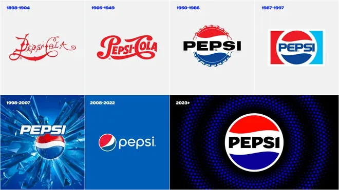
Design-wise the Pepsi logo has kind-of followed whatever design trend was 'trendy' at the time - and as a result the image of the brand (at least in our opinion) dwindled down into nothingness.
Minus a strong aesthetic - Pepsi just comes across as a placeholder for where a strong competitor should be in the so-called 'Cola Wars', rather than one with any kind of defendable credibility.
The 2008-2022 version really is particularly weak and forgettable. The old challenger to the might of Coca Cola seemed to have finally tapped out.
Yesterday, however Pepsi announced yet another visual identity change, but this time they nailed it.
The new Pepsi logo is strong, bold, uncompromising and simple. All involved have done a great job here.
'The committee' has thankfully been fired and somebody with direction has clearly been appointed to steer the brand in a new defined direction.
We are often asked whether a new corporate identity is worth the money and the hassle of going through the change - and my answer to this is very simple...
"If the new identity represents a refreshed vision and brand new approach to how the brand is going to win - then yes it's a wise investment."
We wait to see what new competitive marketing approach emerges from here.

