
BBC Earth has a new logo
The British Broadcasting Corporation is home to one of the most successful TV brands in history; here's how it's getting refreshed for a new era.

We are big believers in well-designed corporate identities.
Nothing presents a business with as much impact and intention than a visual identity that has been created by a true design professional.
It sets the underlying tone for a brand - and in our experience - is worth far more than what most businesses give it credit for. Investing in proper design is never a waste.
A good recent example of a well-known brand refreshing its future image for further impact is BBC Earth; the hugely successful natural history and science TV channel that is owned by the commercial arm of the BBC.
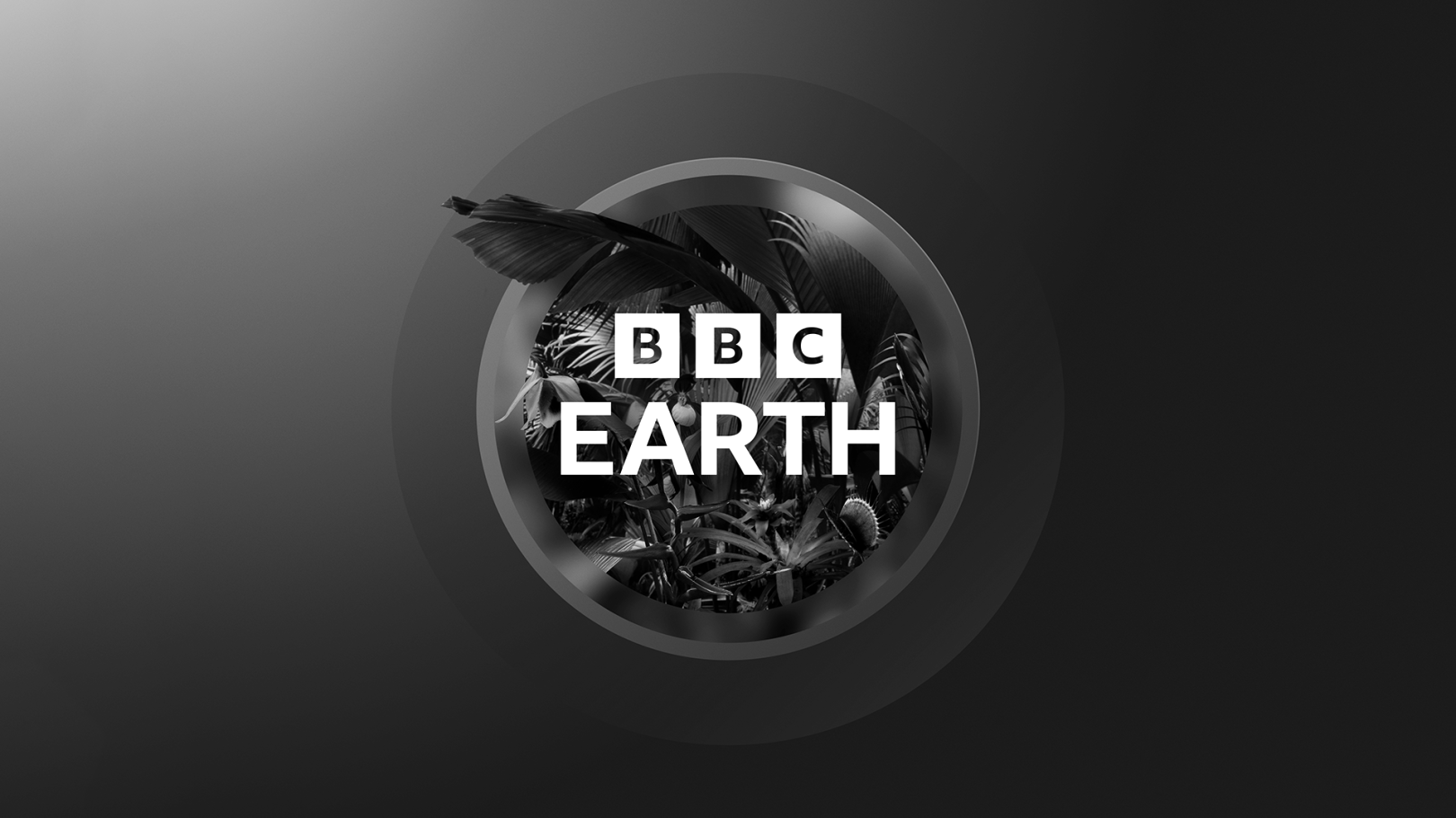
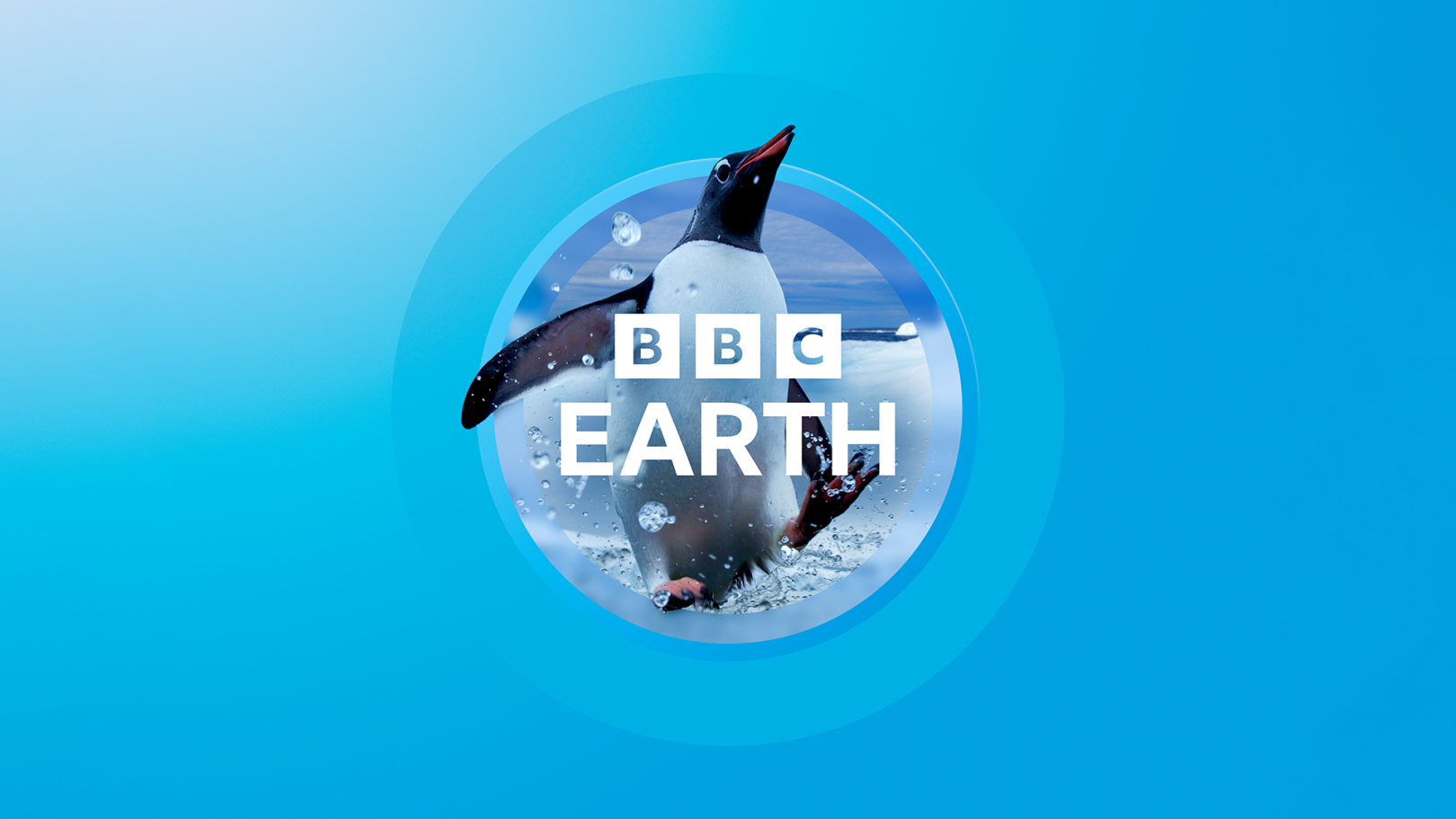
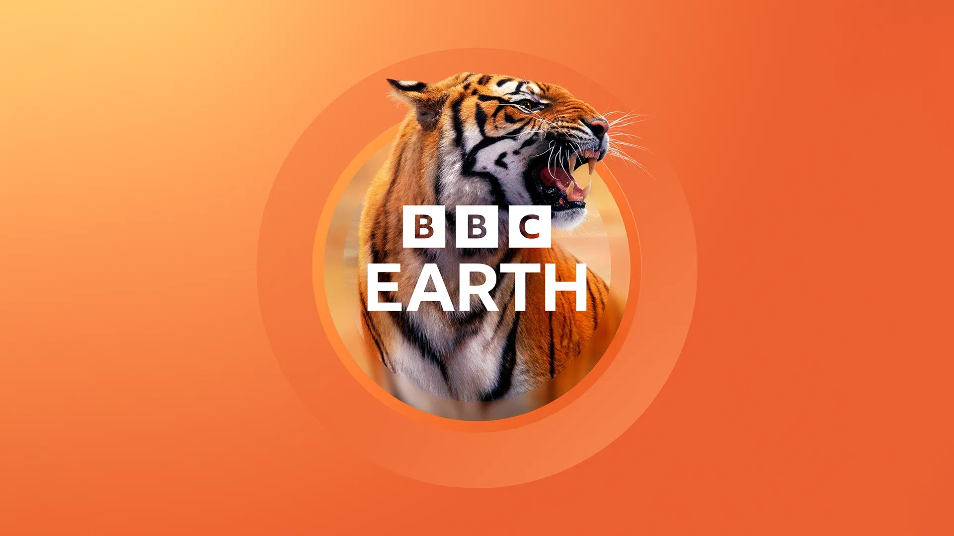
'Window to the World'
The brand refresh aims to convey the message that BBC Earth is the 'Window to the World' through which we are given a front row seat to all that nature offers our visual senses.
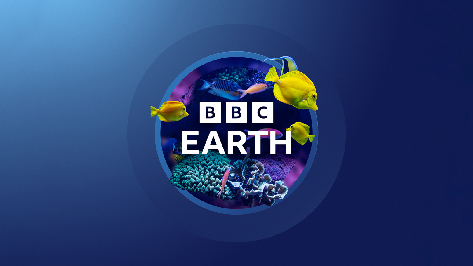
The circular device is indeed that window and lends itself to an infinite array of imagery that can be used in combination with it to showcase some of the stunning visuals that the the brand captures.
The simplicity of it is what makes it really work well. Trust us - when it comes to practically using a logo on signage, online, on a million different coloured backgrounds...the simpler the better.
This works well.
More:
